Introduction.
In the ever-evolving landscape of web design, responsiveness is no longer an option; it’s a necessity.
With a multitude of devices, screen sizes, and orientations accessing websites today, ensuring that your website adapts seamlessly to different screens is paramount.
Elementor, the versatile and user-friendly page builder plugin for WordPress, empowers designers and developers to create fully responsive websites effortlessly.
In this comprehensive guide, we will explore the art of building responsive websites in Elementor.
Whether you’re a seasoned web designer or a newcomer to the world of web development, this article will equip you with the knowledge and skills needed to craft websites that look and function flawlessly on any device.
Let’s embark on this journey of responsive web design with Elementor and discover how to make your websites shine across all screens.
What Is Elementor?
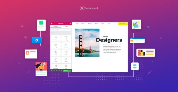
Elementor is a popular WordPress plugin that allows users to design and build websites using a drag-and-drop interface.
It is a visual page builder that simplifies creating and customizing websites without requiring coding knowledge.
With Elementor, users can create and edit web pages by dragging and dropping various elements.
These elements include headings, text, images, videos, buttons, forms, etc. The plugin provides a wide range of pre-designed templates and blocks that can be customized to match the user’s desired layout and style.
Elementor offers a live preview feature, allowing users to see their changes in real-time as they make them.
It also provides a responsive editing mode, ensuring that websites look great on various devices and screen sizes.
Elementor has gained significant popularity due to its user-friendly interface, flexibility, and ability to create visually appealing websites without needing to write code. It has become a preferred tool for many web designers, developers, and website owners using WordPress.
What are The Benefits Of Using Elementor?
Thanks to Elementor, a revolutionary WordPress plugin, building websites has never been easier or more enjoyable.
In this article, we will explore the numerous benefits of using Elementor and how it empowers designers and developers to craft exceptional web experiences.
1. Intuitive Drag-and-Drop Interface.
Elementor’s most defining feature is its intuitive drag-and-drop interface. With a simple mouse click, designers can seamlessly add and arrange elements on their web pages. Everything can be customised effortlessly, from text blocks and images to buttons and forms.
This user-friendly approach drastically reduces the learning curve for beginners, enabling them to design professional-looking websites with ease.
2. Real-Time Visual Editing.
Gone are the days of making changes blindly and refreshing the page repeatedly. Elementor provides a real-time visual editing experience, allowing designers to see the changes they make instantly.
This feature significantly speeds up the design process, as designers can experiment and fine-tune their creations on the fly, resulting in a more efficient workflow.
3. Extensive Pre-Designed Templates and Blocks.
Elementor offers a vast library of pre-designed templates and blocks, catering to a wide range of industries and purposes.
Whether you’re designing a portfolio, a blog, an online store, or a corporate website, Elementor has a template to suit your needs.
These templates provide an excellent starting point for designers, saving time and effort in the initial design phase.
4. Mobile Responsive Design.
In today’s mobile-driven world, responsive web design is paramount. Elementor understands this and ensures that every design created with the plugin is mobile-friendly by default.
Designers can preview how their websites will appear on different devices, and make adjustments as needed, ensuring a seamless experience across various screen sizes.
5. Customization and Creative Freedom.
One of the biggest advantages of Elementor is the unparalleled level of customization it offers.
Designers can control every aspect of their web pages, including fonts, colours, spacing, and animations.
The freedom to experiment and personalize designs leads to unique and visually engaging websites that resonate with the brand and its audience.
6. Advanced Design Effects and Features.
Elementor Pro, the premium version of the plugin, unlocks a treasure trove of advanced design effects and features.
These include parallax scrolling, motion effects, animated headlines, custom CSS, and more.
Such advanced functionalities elevate the overall design quality and enable designers to create eye-catching and interactive elements.
7. WooCommerce Integration for E-commerce.
For those venturing into e-commerce, Elementor seamlessly integrates with WooCommerce. Designers can now create visually appealing product pages, shopping carts, and checkout forms without the need for additional plugins or complex coding.
This integration streamlines the process of building online stores and ensures a cohesive shopping experience for customers.
8. Seamless Integration with Third-Party Plugins.
Elementor’s compatibility extends beyond its native features. The plugin seamlessly integrates with many third-party WordPress plugins, expanding its capabilities even further.
Whether you need to incorporate a contact form, a social media feed, or an email subscription popup, Elementor ensures that the process is smooth and hassle-free.
This integration empowers designers to extend the functionality of their websites without the need for additional development.
9. Faster Website Loading Times
Website performance is crucial for user experience and search engine rankings. Elementor excels in this aspect by producing clean, lightweight code.
This means that websites built with Elementor load faster, ensuring a snappy and pleasant browsing experience for visitors.
The plugin’s optimized code also contributes to better SEO rankings, as search engines favour faster-loading websites.
10. Regular Updates and Community Support.
Elementor is continually evolving, and its team of developers releases regular updates to enhance functionality, security, and user experience.
The committed development team ensures that the plugin remains compatible with the latest WordPress versions and technologies.
Moreover, Elementor boasts a thriving community of users and developers who contribute to forums, support groups, and documentation, making it easier for newcomers to find assistance and learn from others.
11. User Access Controls for Collaboration.
For web agencies and designers working collaboratively on projects, Elementor Pro offers user access controls.
Designers can assign specific roles and permissions to team members, allowing them to collaborate on designs without risking accidental modifications or unauthorized access. This feature streamlines teamwork and enhances workflow efficiency.
12. Cost-Effective Solution.
Considering the vast array of features offered by Elementor, the plugin represents excellent value for money.
The free version provides an impressive set of tools, while the Elementor Pro version unlocks a treasure trove of advanced functionalities.
The cost-effectiveness of Elementor becomes even more apparent when compared to the expenses associated with traditional web design tools or hiring professional developers for every project.
How Do I Build Responsive Websites In Elementor?
Responsive web design ensures that your site adapts seamlessly to different screen sizes and devices, such as smartphones, tablets, and desktops.
Elementor, a popular WordPress page builder, empowers web developers and designers to create responsive websites with ease. In this article, we will guide you through the steps to build responsive websites using Elementor.
1. Plan Your Website’s Structure.
Before diving into Elementor, it’s crucial to plan the structure of your website.
Consider the content layout, navigation menus, and overall user flow. Identify key elements like headers, footers, and sidebars. A well-thought-out plan will make it easier to create a responsive design.
2. Choose a Responsive WordPress Theme.
To build a responsive website, start by selecting a WordPress theme that is inherently responsive.
There are numerous themes available in the WordPress repository, and many of them are designed to work seamlessly with Elementor.
A responsive theme provides a solid foundation for your website’s responsiveness.
3. Install and Activate Elementor.
Once you have your WordPress theme in place, install and activate the Elementor plugin.
You can find it in the WordPress Plugin Directory. After activation, you’ll be able to use Elementor to design and customize your website’s pages.
3. Design Your Pages with Elementor.
Now it’s time to start building your pages using Elementor. Here’s a brief overview of the process:
- Create a New Page: Go to your WordPress dashboard and navigate to “Pages” -> “Add New.” Give your page a title and click on the “Edit with Elementor” button.
- Choose a Page Template: Elementor offers pre-designed templates to kickstart your design process. You can either start from scratch or select a template that suits your needs.
- Drag and Drop Elements: Elementor uses a simple drag-and-drop interface. You can add elements like text, images, buttons, and more to your page. Customize them to match your website’s branding and style.
- Responsive Editing: Elementor offers a responsive editing feature that allows you to preview and adjust your design for various screen sizes. Click on the responsive editing icons to switch between desktop, tablet, and mobile views, and make necessary adjustments for each.
- Use Media Queries: Elementor lets you apply media queries to specific elements, ensuring that they display differently on various devices. This level of control is invaluable for fine-tuning your website’s responsiveness.
4. Optimize Images and Media.
To ensure a fast-loading website and smooth user experience on mobile devices, optimize your images and media.
Use the built-in optimization options in Elementor or consider using third-party plugins like Smush or WP Super Cache.
5. Test on Multiple Devices.
Before launching your website, thoroughly test it on different devices and browsers.
Ensure that all elements are displayed correctly and that there are no layout issues. Elementor’s responsive editing features make it easier to identify and fix any problems.
6. Enable Mobile Responsiveness in Theme Settings.
Some WordPress themes have their own mobile responsiveness settings. Check your theme’s documentation or settings to ensure that mobile responsiveness is enabled. This step can help your website adapt even more seamlessly to different devices.
7. Regularly Update Elementor and Your Theme.
Both Elementor and your WordPress theme may receive updates to improve performance and security. Regularly update these components to keep your website responsive and up-to-date.
Conclusion.
Building a responsive website with Elementor is a straightforward process that empowers web designers and developers to create visually appealing and user-friendly sites.
By planning your website’s structure, choosing a responsive theme, and leveraging Elementor’s powerful features, you can ensure that your website looks and performs well on all devices.
Remember to test thoroughly and keep your website and plugins updated to provide the best possible user experience.
With Elementor’s responsive design capabilities, you’re well on your way to creating a website that impresses visitors, regardless of the device they use.
GIPHY App Key not set. Please check settings